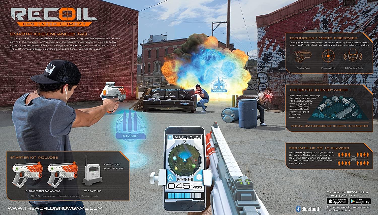
Creating the visual language for Recoil was a great challenge especially the main lifestyle which my Creative Director and I created poses for an illustrator who illustrated the space marine characters we were looking for to convey the high tech value that was inherit in the game. Recoil was touting binaural sound, a physical kick back from an internal mechanism, health and ammo pickups as well as game functions like Capture the Flag. Skyrocket set up a giant activation at Comic-Con in San Diego where famous people and volunteers got a chance to battle each other in such an immersive way.
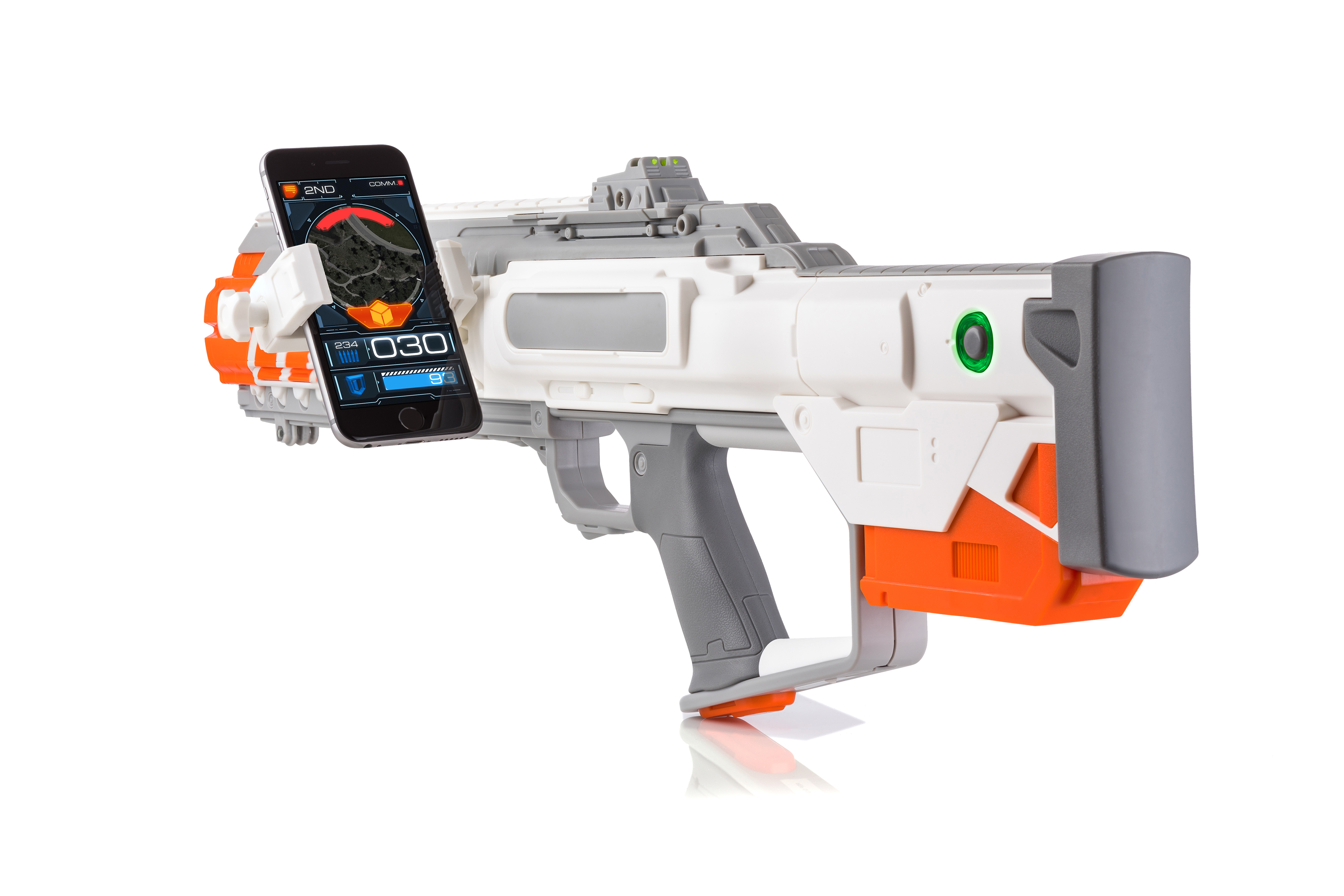
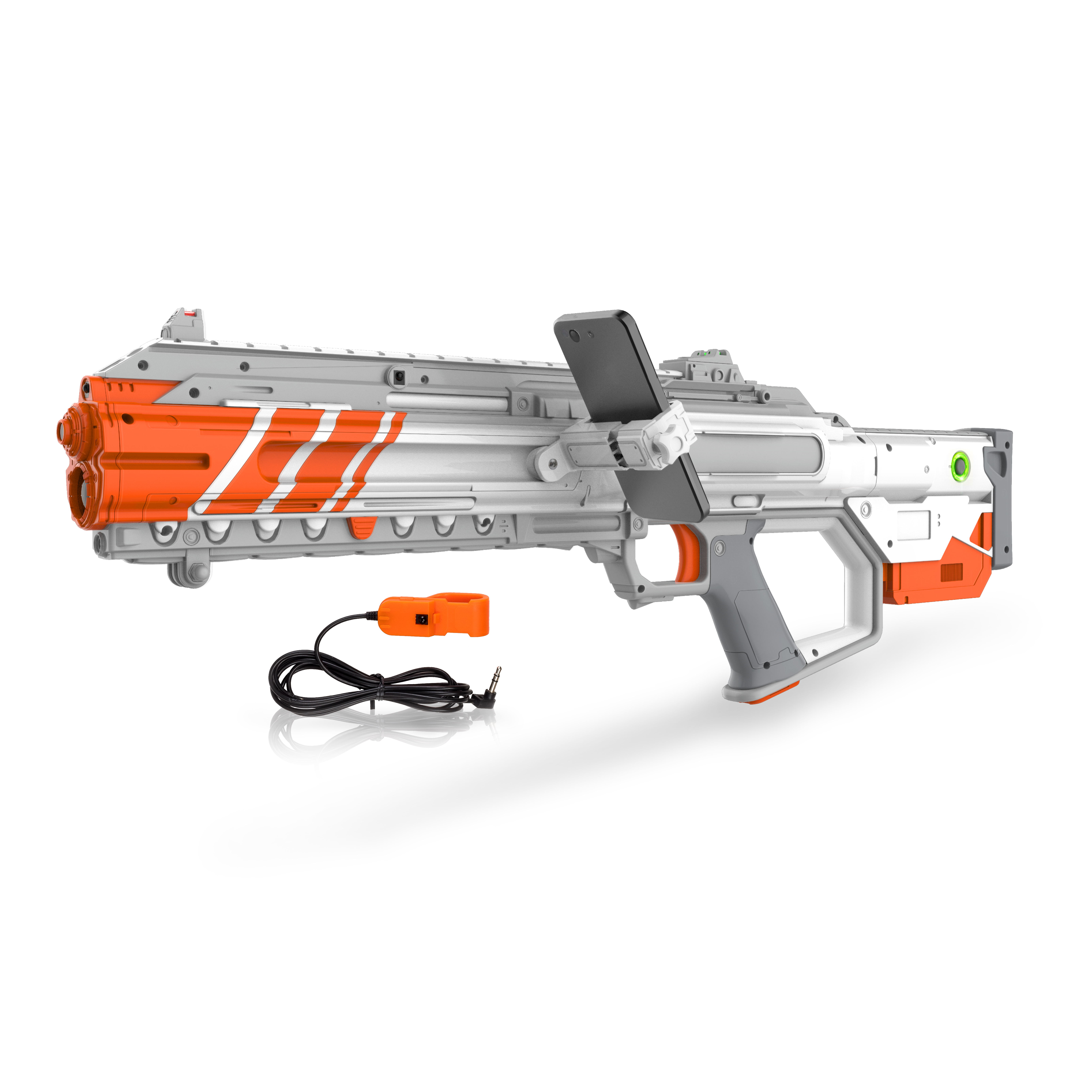
I was very excited to be able to work on the app design and help with the user interface for the Recoil brand. The 3D rendering of the products was the cherry on top of this project, and I was so happy with how they came out. The designs of the guns themselves were very important and deliberated on for months, while I was able to create deco options for the various guns. Deco is another option for being creative in a purely stylistic way, which is fun.
The Starter Set was a key driver because the game requires a hub to host the game. The directive was to portray intensity and precision at a sophisticated level, similar to the look of a high-end videogame. After developing the brand architecture and settling on some poses for the key art, we had an agency illustrate modern day special ops characters that could be clearly seen but not compete with the product itself. We included a beauty shot of the product to make the value proposition crystal clear with the customer.